ShopDreamUp AI ArtDreamUp
Deviation Actions


Suggested Deviants


Suggested Collections


![Five Nights At Freddy's/MLP]Animatronic Pinkie Pie](https://images-wixmp-ed30a86b8c4ca887773594c2.wixmp.com/f/e0cd1238-6fe0-4b90-a5e9-57014ad5376f/d83yxc4-b2d0febc-09fc-4df6-b0b5-0fc500264d22.jpg/v1/crop/w_184,h_184,x_0,y_15,scl_0.38333333333333,q_70,strp/five_nights_at_freddy_s_mlp_animatronic_pinkie_pie_by_sludgeparty_d83yxc4-92s-2x.jpg?token=eyJ0eXAiOiJKV1QiLCJhbGciOiJIUzI1NiJ9.eyJzdWIiOiJ1cm46YXBwOjdlMGQxODg5ODIyNjQzNzNhNWYwZDQxNWVhMGQyNmUwIiwiaXNzIjoidXJuOmFwcDo3ZTBkMTg4OTgyMjY0MzczYTVmMGQ0MTVlYTBkMjZlMCIsIm9iaiI6W1t7ImhlaWdodCI6Ijw9NjQwIiwicGF0aCI6IlwvZlwvZTBjZDEyMzgtNmZlMC00YjkwLWE1ZTktNTcwMTRhZDUzNzZmXC9kODN5eGM0LWIyZDBmZWJjLTA5ZmMtNGRmNi1iMGI1LTBmYzUwMDI2NGQyMi5qcGciLCJ3aWR0aCI6Ijw9NDgwIn1dXSwiYXVkIjpbInVybjpzZXJ2aWNlOmltYWdlLm9wZXJhdGlvbnMiXX0.37yXx9rKtlSIw6GhWq4-HAIExrB4KU4WnzEYq-z7f2Y)
![Five Nights At Freddy's/MLP]Animatronic Pinkie Pie](https://images-wixmp-ed30a86b8c4ca887773594c2.wixmp.com/f/e0cd1238-6fe0-4b90-a5e9-57014ad5376f/d83yxc4-b2d0febc-09fc-4df6-b0b5-0fc500264d22.jpg/v1/crop/w_92,h_92,x_0,y_8,scl_0.19166666666667,q_70,strp/five_nights_at_freddy_s_mlp_animatronic_pinkie_pie_by_sludgeparty_d83yxc4-92s.jpg?token=eyJ0eXAiOiJKV1QiLCJhbGciOiJIUzI1NiJ9.eyJzdWIiOiJ1cm46YXBwOjdlMGQxODg5ODIyNjQzNzNhNWYwZDQxNWVhMGQyNmUwIiwiaXNzIjoidXJuOmFwcDo3ZTBkMTg4OTgyMjY0MzczYTVmMGQ0MTVlYTBkMjZlMCIsIm9iaiI6W1t7ImhlaWdodCI6Ijw9NjQwIiwicGF0aCI6IlwvZlwvZTBjZDEyMzgtNmZlMC00YjkwLWE1ZTktNTcwMTRhZDUzNzZmXC9kODN5eGM0LWIyZDBmZWJjLTA5ZmMtNGRmNi1iMGI1LTBmYzUwMDI2NGQyMi5qcGciLCJ3aWR0aCI6Ijw9NDgwIn1dXSwiYXVkIjpbInVybjpzZXJ2aWNlOmltYWdlLm9wZXJhdGlvbnMiXX0.37yXx9rKtlSIw6GhWq4-HAIExrB4KU4WnzEYq-z7f2Y)


You Might Like…


Featured in Groups


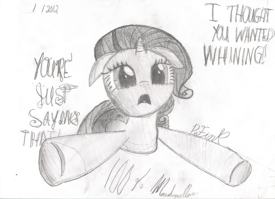
Description
.
Image size
7008x5072px 1.98 MB
Comments15
Join the community to add your comment. Already a deviant? Log In
First off, your style is quite nice. Of course, I'm biased, being a pencil artist myself, but there you go.
The main thing that sticks out with me is the technique. You seem to have a basic grasp of shading, but the execution is a bit inconsistent. For instance, you shaded the area around her tail and the edges of her hooves, but everything else is missing shading. The arms might benefit from shading in order to suggest roundness.
Lines are a bit of a mess as well. I would work on trying to get smooth lines, perhaps going over them with an eraser to clean up stray edges. I do it all the time, and my art looks much better than it used to before I did this. Having a consistent line weight would help as well.
Back to shading, the overall tone needs work. There's an excellent book called Drawing Realistic Textures in Pencil by J. D. Hillberry which I read recently, and one of the things he recommends and that I do is to shade the object by following the contours. For instance, on the arms, all the pencil strokes are opposing the shape you're trying to suggest with the round end of the hoof. By following the curve of the hoof with each stroke, you will reinforce the notion of "This is round". This applies to everything, from the mane to the head, and is especially important with hair, as it makes the "stranded" look without needing to draw each individual strand. It took a bit of practice, but this now comes naturally to me, so don't let this technique scare you.
The eyes are well done. I might suggest instead of drawing a line around the elements like the irises and highlights, just use tone to draw the borders. It looks fabulous when done right.
One last word: try your hand at blending. It's not hard to grasp or master, and will make your work look so much better. Basically, just rub a piece of cloth or paper towel over your shaded areas to blend the tones together and smooth them out. This is helped by first taking away the texture of the paper by rubbing it with something smooth, but even if you don't pretreat your paper you will still get a great result. The best tool for this though is a blending stump. They come in many sizes, are quite cheap, and enable you to blend in tiny areas, thereby saving more detailed work from being damaged. Note that this doesn't eliminate the need to follow the contours with your pencil strokes.
I hope you found this useful. I sure wish somepony had given me these tips a long time ago. <img src="e.deviantart.net/emoticons/s/s…" width="15" height="15" alt="